Tuesday 31 July 2012

The Emperor's New Clothes - "-19°C at a height of 5km"?

The Atmospheric Greenhouse Effect - Do you understand it?

The question might be expanded to ask "does anyone"? I ask it because it's taken me about 8 years to get my head around all (or at least most of) the subtleties of detail, and while I've been doing that, my realisation has grown that many, including scientists, technical authors, and well-respected bloggers, do not understand some of the basics, or at least give that impression in what they say and write. Even the authors of IPCC AR3 seem somewhat confused. Pure arrogance on my part you might think, but hear me out before you write me off or label me in some way I'd rather not know.

There's one concept expressed in many descriptions of the greenhouse theory; pet theories, objections and rebuttals are based on it, calculations of parameters are formulated using it. The concept is formed using mere words, but some people's minds have been so seduced by those words that they believe, are convinced even, that the concept in some way reflects physical reality. It does not; it's a chimera, the "Emperor's New Clothes".

The concept is this: the "effective emission temperature" of the combined Earth/atmosphere system. It leads to a major misunderstanding in the claimed magnitude of the greenhouse effect (GHE), that the Earth is some 33°C warmer as a result of the effect of greenhouse gases in the atmosphere. To understand how the misunderstanding arose, it's worth quoting IPCC AR3 WG1, 1.2 Natural Climate Variations 1.2.1 Natural Forcing of the Climate System
For a stable climate, a balance is required between incoming solar radiation and the outgoing radiation emitted by the climate system. Therefore the climate system itself must radiate on average 235 W/m² back into space. Details of this energy balance can be seen in Figure 1.2, which shows on the left hand side what happens with the incoming solar radiation, and on the right hand side how the atmosphere emits the outgoing infrared radiation. Any physical object radiates energy of an amount and at wavelengths typical for the temperature of the object: at higher temperatures more energy is radiated at shorter wavelengths. For the Earth to radiate 235 W/m², it should radiate at an effective emission temperature of -19°C with typical wavelengths in the infrared part of the spectrum. This is 33°C lower than the average temperature of 14°C at the Earth's surface. To understand why this is so, one must take into account the radiative properties of the atmosphere in the infrared part of the spectrum. Of the incoming solar radiation, 49% (168 W/m²) is absorbed by the surface. That heat is returned to the atmosphere as sensible heat, as evapotranspiration (latent heat) and as thermal infrared radiation. Most of this radiation is absorbed by the atmosphere, which in turn emits radiation both up and down. The radiation lost to space comes from cloud tops and atmospheric regions much colder than the surface. This causes a greenhouse effect. Source: Kiehl and Trenberth, 1997: Earth's Annual Global Mean Energy Budget, Bull. Am. Met. Soc. 78, 197-208.
Figure 1.2: The Earth's annual and global mean energy balance.

The key sentence is this
For the Earth to radiate 235 W/m², it should radiate at an effective emission temperature of -19°C with typical wavelengths in the infrared part of the spectrum. This is 33°C lower than the average temperature of 14°C at the Earth's surface.
... and the key word is effective, because the radiation to space is not emitted at an emission temperature of -19°C. Longwave IR radiation to space comes from three sources; from the "cloud tops and atmospheric regions" mentioned above (which are at different temperatures), and also the surface (implied but not explicit in the excerpt), which is at a very different temperature. There are thus three sources, all at different temperatures, radiating different amounts. For the quoted 235 W/m² outgoing flux to be input to the Stefan-Boltzmann equation to derive an emission temperature, it would have to be emitted by a single source, and would have to conform to the envelope of a Planck curve. It is not, and it does not. The "effective emission temperature" has no basis in reality, neither has anything based on it.

Here's a satellite view of longwave IR emitted to space over the western tropical Pacific. The surface at around 22°C or so is a little warmer than the 14 or 15°C (287 or 288°K) taken to be the global average surface temperature, but it illustrates the point well. The dashed lines represent Planck curves for their labelled temperatures in degrees Kelvin. The portion between 25µm and 17µm is emission from water vapour, from 17µm to just over 13µm from carbon dioxide, 13µm to 8µm from the surface (with a "bite" from ozone centred on 9-10µm), and the rest to the right from water vapour. The tiny downward spike over wavenumber 1300 represents methane. Note where a 254°K (-19°C) Planck curve would lie, just below the marked 260°K curve.

From G.W.Petty "A First Course in Atmospheric Radiation"
Worse, many (including IPCC authors) assume that 235 W/m² is what the Earth would radiate in the absence of either greenhouse gases (GHGs) or the entire atmosphere, and conclude that the resulting temperature would be the -19°C "effective emission temperature" (or -18°C calculated by some). That assumption and conclusion are not valid. If radiation to space is from three sources; GHGs, cloud tops, and surface, then removing two of those sources from the system leaves just one, the surface. It's an unjustified leap of logic to assume that the remaining source, on its own, would radiate what all three together did.

In the absence of an atmosphere there'd be no clouds to reflect incoming solar radiation, no water vapour to absorb much of the solar short-wave infrared, no ozone to absorb ultra-violet. All incident solar radiation (342 W/m² in Figure 1) would reach the surface. If we assume for this thought experiment that the surface would be as it is now (ocean/desert/rock/vegetation/ice), then some of it would be reflected, in the same proportion as shown in the diagram, that is 30/198 x 342 = 52 W/m², leaving 290 W/m² to be absorbed, and therefore to be emitted as radiation to restore the radiative balance. Using the Stefan-Boltzmann Law to calculate the emission temperature, assuming perfect emissivity and that the temperature of space is 2.7°K, results in a surface temperature of -5.5°C, not the -18°C or -19°C almost universally quoted.

Working out what the resulting surface temperature would be if the green house effect were simply "turned off", that is all elements of Earth and atmosphere are present, but GHGs wouldn't absorb or radiate longwave IR, is rather more complicated, and best left for another post, as is a critique of the Kiehl and Trenberth "energy budget" diagram shown in Figure 1.

The 5km mentioned in the title is derived from the adiabatic lapse rate (rate of cooling with height) using the fictional --19°C "effective emission temperature", so it too is a fiction, a fiction created entirely by IPCC authors in AR3 WG1 chapter 1.2:
The natural greenhouse effect
The atmosphere contains several trace gases which absorb and emit infrared radiation. These so-called greenhouse gases absorb infrared radiation, emitted by the Earth's surface, the atmosphere and clouds, except in a transparent part of the spectrum called the "atmospheric window", as shown in Figure 1.2. They emit in turn infrared radiation in all directions including downward to the Earth's surface. Thus greenhouse gases trap heat within the atmosphere. This mechanism is called the natural greenhouse effect. The net result is an upward transfer of infrared radiation from warmer levels near the Earth's surface to colder levels at higher altitudes. The infrared radiation is effectively radiated back into space from an altitude with a temperature of, on average, -19°C, in balance with the incoming radiation, whereas the Earth's surface is kept at a much higher temperature of on average 14°C. This effective emission temperature of -19°C corresponds in mid-latitudes with a height of approximately 5 km. Note that it is essential for the greenhouse effect that the temperature of the lower atmosphere is not constant (isothermal) but decreases with height. The natural greenhouse effect is part of the energy balance of the Earth, as can be seen schematically in Figure 1.2.
A fiction built upon a fiction, the "Emperor's New Clothes" are the wrong colour, and the wrong length. Don't get caught admiring them.

Wednesday 18 July 2012

Wellington sea level rising fastest in NZ? No - more falshoods.

The New Zealand press is wetting itself, and it's not from the feet up. here's a sample from Scoop Business
Two reports released today show Wellington has the highest rate of sea-level rise in New Zealand and highlight areas in the region that are vulnerable to coastal flooding over the next 100 years.
The reports, commissioned by the Greater Wellington Regional Council (GW), look at sea-level rise and coastal flooding from storm events in the Wellington region including current trends and future scenarios based on those trends. Wave heights, wind strength, storm-tide levels, sea-level variability and large-scale storm events are all assessed.
Findings from the studies and the implications they are likely to have on the Wellington region’s coasts, communities and local authorities were presented today. 
... and another
Parts of coastal Wellington could be drowned if doomsday climate change predictions from a new study pan out over the next 100 years.
Two reports issued yesterday by Greater Wellington regional council show Wellington's sea level is the fastest rising in New Zealand - made worse by seismic rumblings causing the city to sink 1.7mm a year since 2000.
One slight problem with all of this - sea level at Wellington has barely risen at all since 1999.


Amazingly, the NIWA report Sea-level variability and trends: Wellington Region (helpfully linked from the Scoop Business report, hats off to them) actually shows just that, though the text completely ignores the fact.

The report states on page 37:
Regional subsidence, from slow-slip events, has increased the relative sea-level trend in the Wellington area since ~1997. This trend varies across the Wellington region, 
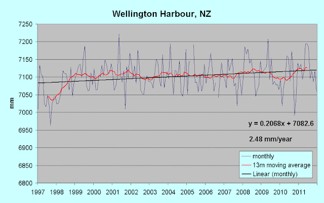
Reality check - here's the plot from 1997


Does a change from 2.44 mm/year for the entire record to 2.48 mm/year for 1997 onwards constitute an "increased sea-level trend"? I leave you to judge whether it is even worth mentioning. Moving the start year forward to 1999 reveals the tiny trend I highlighted above.


Plotting the change in annual rate from 1944 to 1980 and subsequent years to 2011 confirms it.


The rate has stabilised at almost exactly 2.5 mm/year (slightly different from that shown on the first chart above as it's calculated from annual averages, not monthly data). There is a change in the rate from 1997, but it's progressively reduced to a flat trend as the 1999-onwards "plateau" has an increasing influence.

There's an awful lot of information in that report (it's 74 pages long!) that I deem useless and confusing to any planner who wanted the "bottom line". In my opinion it's an attempt to "blind with science". Who's going to care much exactly which benchmarks were used over the life of the gauges, or precise details and dates of GPS surveys, or discussions of Arctic and Greenland melt rates? Then there's this (p57)
Relative SLR at Wellington is presently tracking towards a SLR of 0.9m by 2090s or ~1.0m by 2115 and is similar to tracking of the global-mean (relative to 1980-1999 sea levels), though based on a short sea-level average at Wellington from 2006-2011.
What? They're basing a prediction over a period of up to 103 years on a period of just six years? Note the slight uptick over the 2011 mark in the 13-month moving average on the 1999-2011 chart above. Very convenient to end their "short average". Have another look at the first (long-term) chat above. Does that look like it's heading for "~1.0 m by 2115"? This report is crap dressed up as a scientific report. It's pure bluster and alarmism, padded out with irrelevancies. They've no data to prove any such thing, and chose a very short period to give themselves the answer they want.

Tuesday 17 July 2012

Extending the record - Nauru, west-central Pacific

Nauru is a small rocky island just 0.5° south of the equator. I have a slight connection with Nauru in that I was tasked with analysing rock samples from Nauru for phosphate content, many (many!) moons ago. Nauru has a SEAFRAME tide-gauge (and meteorological) installation on the west of the island, maintained by the South Pacific Sea Level and Climate Monitoring Program run by the Australian National Tidal Centre (BOM). A chart for Nauru (1993-2011) is included on the  South Pacific Sea Level reference page (sidebar top). PSMSL has data from an earlier gauge which I will refer to as Nauro-A, and the 1993 installation as Nauro-B. The overlap between the two records spans just 18 months, but the difference (due to different benchmarks used) varied little over that period, averaging 267mm.


With the data from Nauro-A reduced by 267mm until the date of the 1993 installation a reconstruction from mid-1974 to end 2011 is possible.


Note that while the overall rate is just 0.59 mm/year, the trend line is below the 13-month moving-average line on the left.


A plot of the annual rate from 1974 to the year on the lower axis confirms that the long-term rate has stabilised at just over 0.5 mm/year. Is Nauru rising from the waves, cancelling out the effect of much of the sea-surface rise?


The GPS plot from the station on Nauru seems to contradict that idea, at least between 2003 and 2009 (latest available on the 'net). If anything, the station dropped a little over that period, which would have increased the gauge readings. With this reconstruction, and the convincing data from Hawaii in my last post (amongst many other instances), I'm beginning to doubt the veracity of the claimed 3.2 mm/year "accelerated" rate post-1993 (satellite era for sea-level measurements).

Thursday 12 July 2012

Aloha! - Can the Hawaiian Islands tell us anything about global sea-level?

Sea-levels are rising relatively quickly in the western and south-western Pacific; they are rising hardly at all (falling in some locations) in the east, especially along the western seaboard of the U.S. This disparity is being driven by both sea temperature and wind direction (see ref. below), interrupted by an irregular "slosh" to the east during El Niño events, which significantly lowers sea-levels in the west, and raises them in the east (see The Footprint of El Niño).
Linear trend (1993-2010) of satellite altimeter sea surface height showing he region of high rates in the western Tropical Pacific (Source)
It occurred to me that somewhere in the "middle" of the Pacific, there should be a "mid-point" between the two extremes, and an ideal candidate seemed to be the Hawaiian Islands. The islands form a chain, running roughly west-north-west, formed as the supporting tectonic plate moved over a "hotspot" in the mantle, forming volcanoes which became islands when they broke the surface of the ocean. The oldest and most stable islands are to the NW, the youngest and volcanically active to the SE. The chain is far longer than most people think, extending to Midway Atoll (of WWII fame) far to the WNW of the well-known islands of the US state of Hawaii.

Source (much larger image): NOAA

Here's a simulated (and rather satisfying) satellite image of the main group; Kaua'i is the larger island on the left, O'ahu to the right of it, left of centre, Maui of similar size right of centre, and Hawa'ii (Big Island) very prominent on the right. I understand there's an undersea volcano some 20km to the SE of Big Island, it may have broken the surface in 20,000 years or so, and if mankind survives CAGW and catastrophic sea-level rise, might be seen by future generations. Could it be the white blob in the bottom RH corner? Book your holidays now.

Source: NOAA

Midway demonstrates the late 20th., early 21st. century shift upwards quite well (note that the data extends to end 2011 in all cases).


Midway shows an interesting trend; dropping until the late 1970s, climbing to a relatively stable period from the late 1980s to 1997, when there's a sharp dip (not reflected in the 5-year (61 month) moving average) due to the 1997/8 El Niño. There's then a sharp rise to 1999 and a significantly higher level (clearly shown by the moving average). Don't pay any attention to the overall trend; with such fluctuating levels, it's clearly meaningless. Moving down to the westernmost island in the main group. Kaua'i Island, where the overall trend is steadier and more meaningful:


No sign of late 20th. century acceleration evident there. Next O'ahu, where the capital Honolulu is situated:


Honolulu shows more peaky 5-year profile, but still a relatively steady trend, reflected in a plot of annual averages:


The long-term rate evolution below, produced by plotting the linear trend from 1905 to the year shown on the x-axis reveals that the long-term trend is still reducing; if there'd been a significant shift upwards in annual rate in recent decades, the plot would show first a flattening, then an upward trend, in this plot.


Mokuoloe Island (Coconut Island) in Kaneohe Bay on the NE coast of O'ahu.


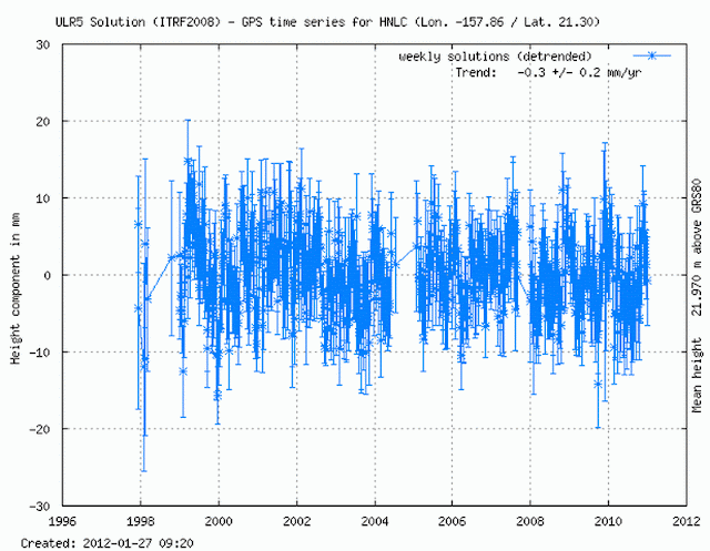
Is the reason Honolulu and these other islands show a rate lower than what we're told the global rate was over the 20th.century due to the land rising? The GPS plot for Honolulu seems to show otherwise, at least for the recent past. There's little vertical movement; the trend is -0.3 mm/year since 1998.

Source: SONEL

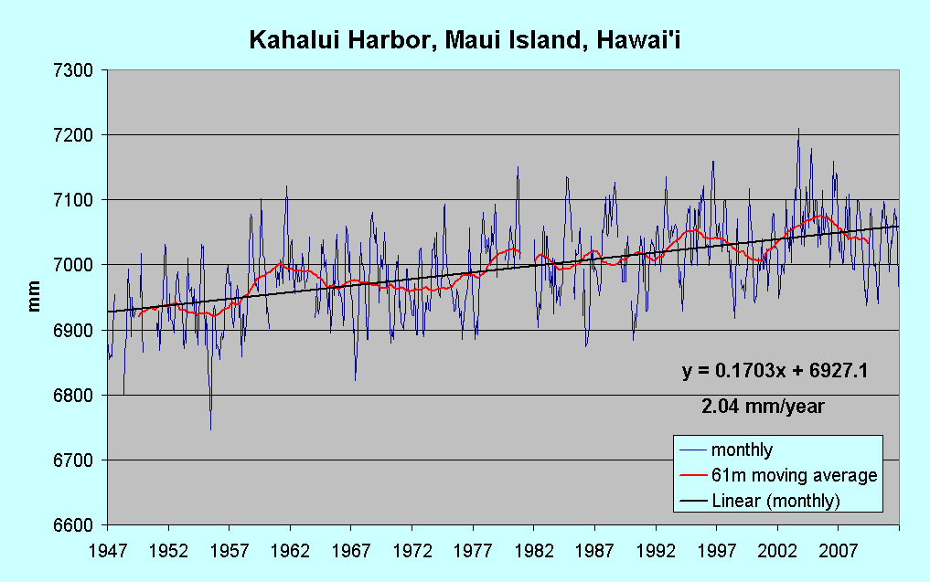
Kahalui Harbor, Maui Island.


The rate's a little higher, but the overall profile is similar to Kaua'i Island.

Kawaihae, on the NW coast of Hawai'i Island (also known as Big Island, for obvious reasons)


This is the island with the BIG volcanoes, and the if change in actual sea level ( as opposed to the rate relative to the land, as shown by the tide gauge) is the same or nearly so as that at the islands covered so far, then it (or at least the gauge) must be sinking at a significant rate.

Hilo,on the NE of Hawai'i Island shows rather less of a rate. Perhaps the island is tilting somewhat?


I'd say that my hypothesis has some evidence to support it. If so, does it mean that some estimates of past and current sea-level rise are in error? There may be other gauges situated in "neutral zones" relatively unaffected by climatic cycles which give a better, or at least less distorted picture of sea-level rise than we're being presented with.

UPDATE: 14th. July 2012

I came across this picture of Hawai‘i Island, with the location of my "undersea volcano" actually known as Lōʻihi Seamount. It's not the "white blob in the bottom RH corner" of the illustration of the main island group above, but the lesser blob just above it, and it's 20 miles off the coast, not my "20 km".

 Lōʻihi Seamount,  Hawai'i Island, Hawai'i      Source: University of California, Santa Barbara
Amazingly enough, the article is titled Lö‘ihi: Hawai‘i’s Newest Island—But Don’t Book Your Flight Yet - the author obviously has a short-term outlook. If you're interested in volcanoes (who isn't?) read the article - it's fascinating.

Reference: Regional sea-level trends due to a Pacific trade wind intensification
Merrifield, M. A., and M. E. Maltrud, Geophys. Res. Lett., in press, 2011.

Data Sources: (in order of presentation):
Midway Island
Nawiliwili Bay, Kaua'i Island
Honolulu, O'ahu
Mokuoloe Island
Kahalui Harbor, Maui Island
Kawaihae, Hawai'i Island
Hilo, Hawai'i Island

Saturday 7 July 2012

Extending the record - Cook Islands, Rarotonga

There's been a lot of discussion over the past few years about the so-called "vanishing islands" in the central and western Pacific. Much of is nonsense, on the one hand alarmists claiming the populations are doomed, that many islanders have relocated, are relocating, or will relocate anytime soon (take your pick, none of these claims are ever substantiated), on the other hand some AGW sceptics claim (without proof, there is none) that sea levels there haven't risen in the past, and by implication or statement, that they therefore won't rise much, if at all, in the future.

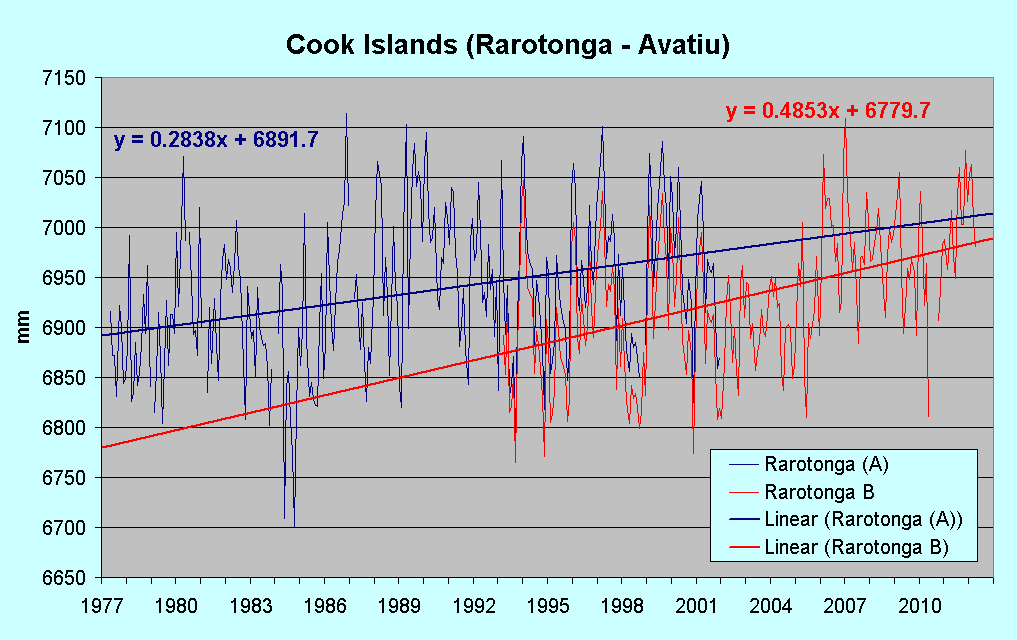
There's also a more sanguine, realistic, and balanced view of the situation, from those who actually scrutinise the data, and take the longer view. I'm one such who believes that data is truth, analysis is interpretation, and that the "longer view" is aided by longer datasets. The Australian National Tidal Centre's "South Pacific Sea Level and Climate Monitoring Project" does a great job measuring and archiving sea level and climate data for many Pacific islands - their data forms the foundation of my South Pacific Sea Level reference page (sidebar top). However, their record is relatively short, and can give an inflated view of sea level rise in many cases. For example, the chart for the southern Cook Islands island of Rarotonga shows a rate of 5.25 mm/year rise to end 2011. Many of the NTC gauges on the Pacific islands were completely new installations, but the one on Rarotonga replaced an earlier gauge which recorded from 1977. The NTC doesn''t archive data for the older gauge, but PSMSL does, along with a slightly out-of-date record (end 2011) for the new gauge (updated to April 2012 from NTC data), and here are both plotted together:


The trend lines show that short-term data can give very different impressions of trends, even more emphasised when the slightly adjusted (-40 mm) earlier data is spliced onto the start of the later:


 .... when a much lower trend than either emerges. I've another reconstruction under construction (ouch!) which will show an even more interesting past (and a possibly less than interesting future, that's a good thing!) for another island in the area.

Data sources:
Rarotonga 1977-2001
Rarotonga B 1993-2011
Rarotonga 1993-2011 (NTC)

Wednesday 4 July 2012

Aeolus Rules the Waves - Proof from Portland, Australia

Poseidon may be the god of the ocean, but Aeolus, god of the winds, has a strong hand in ruling it. While working on something else entirely, I plotted the hourly tide data for Portland, Victoria for January/February this year, hoping to be able to correlate wind direction with tide height.

The red line is a 25-hour moving average, 25 being appropriate for two reasons; a moving average should span an odd number of periods or data-points (so it has a centre), and the tidal cycle is much closer to 25 hours than 24, so it should be largely filtered out. While wind direction must have an effect on tide height, higher when wind is blowing onshore, lower when offshore, the effect was being overwhelmed by something else; something I was well aware of, but had thought (hoped) to have a lesser effect. It's barometric pressure - a change of one millibar (hPa if you're insistent) affects sea level by about 1 centimetre; lower if the pressure's higher, and vice versa. Higher pressure "pushes" the surface down. Because the effect is magnified 10 times, plotting the pressure on the same chart reveals nothing; the pressure plot barely wiggles. By converting the tide height to millimetres, turning the pressure values into anomalies (deducting 1000), and multiplying by 10, adding 1000 (to position the resulting plot), I got the following:

That looks to be a fairly convincing correlation, but because the relationship is inverse, the effect's spoiled. Here's the result of inverting the anomaly and dropping the line a little:

IMHO that's a convincing illustration of Aeolian power. Atmospheric pressure is altering sea level by as much as 50% of the lunar tidal range (difference between low and high water).

Now let me see - if I deducted the pressure effect, allowed for the predicted tidal cycle.... but that's for another day, another post (maybe).