Monday, 24 September 2012

Would you believe a scientist who can't do simple maths?

Apparently (it's always apparently, may or could or might) the Earth is running out of plants. What's the Earth using the plants for, I hear you ask (well I asked it anyway). It's not the Earth using the plants at all, of course, but us. "Scientist claims Earth may run out of plants" wails CBS News uncritically, repeating an article "Will Earth Run Out of Plants?" in LiveScience, which begins
Humans may be very close to extracting all of the Earth's available plant resources, says a University of Montana researcher.
In fact, said Steven Running, a professor in the university's College of Forestry and Conservation, humanity may realistically have only 10 percent or so of our planet's annual plant resources in reserve, with little ability to boost yearly growth. The calculations don't suggest that humanity is on the verge of starvation, Running said, but they do indicate there are limits to our species' growth.
Note that he's in the College of Forestry and Conservation - I'll return to that factoid in a while.
Thanks to satellite measurements, researchers can now calculate how much vegetation the Earth produces each year. Over 30 years of observation, Running said, the number has stayed remarkably stable at 53.6 petagrams (one petagram is one trillion kilograms, or about 2.2 trillion pounds).
That's a lot of greenery. But humans use about 40 percent of it annually, Running said. The number would seem to offer plenty of wiggle room for humanity, but in fact, only about 10 percent of the remaining vegetation is up for grabs, he said.
That 10% of the remaining vegetation (60%) must be 6% of the whole, right? Nope - this is where the prof's arithmetic goes astray (or has already gone astray?).
"If humans are appropriating about 40 percent of annual production, if another 50 percent we can't harvest and appropriate, then that only leaves about 10 percent," Running said. "Well, that starts to sound a lot closer to a planetary boundary."
That sounds a lot closer to a mishtake, shurely? Is it 6% or is it 10% prof? In fact it isn't either. If, as the prof states, 10% is left, then we have 10% out of the 50% left to use - I make that 10/50 - 20% left from what we can use, or put another way, we could possibly increase our use by 10/40 or 25%. Doesn't seem quite so bad when you put it that way, does it? Why didn't the prof put it that way?
"What we've found is that the vast majority of that other 60 percent isn't available at all," he said. It's either locked up in root systems and unharvestable, conserved in national parks or wilderness areas crucial for biodiversity, or simply in far Siberia or the middle of the Amazon, where there are no roads and no way to harvest it.
No roads, eh? No hope for mankind then? "Far Siberia" where there are no roads, like the Trans-Siberian Highway and the Trans-Siberian Railway? I've heard of the Amazon - it's a big forest in South America, or something. Conservationists (remember College of Forestry and Conservation?) have been wailing for decades about forest clearance and the road building necessary to move in the equipment and transport to do the dirty deed. Doesn't deforestation decrease the vegetation he's talking about? If that's caused a decrease, as it must have, doesn't that mean that there has to have been an increase in other vegetation to keep the total "remarkably stable"? Bear with me, I'm just a simple chap, and obviously can't grasp the complex science involved.
There are arguments against this imminent vegetal limit, Running said: It's arguably possible that humanity could increase plant production with fertilizer or irrigation (though both of those are also in limited supply and have downsides such as pollution), or that we could construct more roads into the Amazon to avail ourselves of more natural resources.
Just a minute - we are increasing plant production with fertilizer and irrigation - crop yields are increasing worldwide. So if "we" construct more roads we could avail ourselves of more of the 50% of natural resources that he said "isn't available at all"?
"And again, you would question how far that would go and whether that's a planet we want, where every single acre from wall to wall has been completely harvested and is in some sort of controlled annual plant production cycle," he said.
"Controlled annual plant production cycle" - it's called agriculture, prof.


Sunday, 2 September 2012

Another "chimera" to frighten us - Antarctic methane

"Antarctic researchers found as much as 400 billion metric tons of carbon hidden under the ice sheets, with the potential to seep out as methane and accelerate global warming." wails Bloomberg reporter Alex Morales. How did they "find" all that methane? Drilling through the ice? Well no, the "Antarctic researchers" haven't actually found anything under the ice, least of all methane. That sentence is straight out of Morales fertile imagination. The "Antarctic researchers" have deduced that "The Antarctic Ice Sheet could be an overlooked but important source of methane". according to the press release on the University of Bristol website.
The new study demonstrates that old organic matter in sedimentary basins located beneath the Antarctic Ice Sheet may have been converted to methane by micro-organisms living under oxygen-deprived conditions. The methane could be released to the atmosphere if the ice sheet shrinks and exposes these old sedimentary basins.
"May have been converted", "could be released", "if the ice sheet shrinks" - doesn't sound like the certainty or near-certainty expressed in the Bloomberg and other press and blog reports. Surprisingly, HuffPo has a balanced and surprisingly accurate (I'm a biased naysayer  of course, but credit where credit's due) report "Antarctic Methane: A New Factor in the Climate Equation" by Climate Central writer Michael D. Lemonick.
Wadham and her colleagues didn’t actually detect the Antarctic methane directly. What they did do was to prove that the frozen continent has all the right conditions in place to make methane deposits a very likely bet.
Thank you Michael, for that antidote to the exaggerated and factually inaccurate (is a factual inaccuracy a lie?) of the mainstream media doomsayers. he continues
The first link in their chain of reasoning is the fact that Antarctica was largely ice-free millions of years ago, sporting lush forests that eventually decomposed to form soil rich in organic matter. Parts of West Antarctica were open water, where marine life created similarly rich sediments at the bottom of the sea — sediments that are up to eight miles thick in some places, with thousands of feet of ice on top of them.
In principle, bacteria should have decomposed some of these vast storehouses of organic matter into methane. The methane should bubble up to the undersides of the ice sheets. Once there, the freezing cold and high pressure of the overlying ice should have transformed them into deposits known as methane hydrates, the same formations scientists know are trapped on the continental shelves of the Arctic Ocean.
Morales waffles on in his total misunderstanding of both the research and what the researchers actually said.
The carbon stored under Antarctic ice is on par with the amount held in the northern hemisphere’s frozen permafrost soils and the lower end of estimates for methane trapped under the Arctic Ocean, according to Jemma Wadham, professor of Glaciology at the U.K.’s University of Bristol and lead author of a study in the journal Nature yesterday.
"Is on par"? The Bristol Uni press release says
They also calculated that the potential amount of methane hydrate and free methane gas beneath the Antarctic Ice Sheet could be up to 400 billion tonnes (that is, 400 Pg of carbon), a similar order of magnitude to some estimates made for Arctic permafrost.
"Could be......a similar order of magnitude to some estimates made for Arctic permafrost" - Morales should stick to his reports on wind and solar power, wherein he swallows figures for installed capacity and equates them with delivered energy.

The final word from the Nature abstract "Potential methane reservoirs beneath Antarctica"
We calculate that the sub-Antarctic hydrate inventory could be of the same order of magnitude as that of recent estimates made for Arctic permafrost. Our findings suggest that the Antarctic Ice Sheet may be a neglected but important component of the global methane budget, with the potential to act as a positive feedback on climate warming during ice-sheet wastage.
Fair enough.

Wednesday, 29 August 2012

High and Dry in San Francisco - NOAA's Ark?

Here's a beach pic at the Presidio, north of San Francisco, not that far from the Golden Gate bridge (seen on the extreme left).


Weather's a bit dull, but there's plenty of sand on the beach. Here's a sunnier view.


The small hut on the right contains the tide gauge for San Francisco. Both pics are from the NOAA station information page for that gauge. Based on the first pic, how would you rate the chances of the gauge registering low water accurately?

Sunday, 26 August 2012

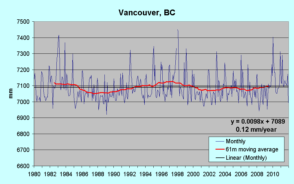
Rising sea levels throughout metro Vancouver putting landmarks at risk - Vancouver Sun

"Rising sea levels throughout metro Vancouver putting landmarks at risk" says the Vancouver Sun (my bold).
VANCOUVER, B.C.: AUGUST 1, 2012 -- Andrew Yan (L) and Michael Heeney (R) at Vancouver’s Granville Island, August 1st, where they have done a study on the rising sea levels. Dikes and other infrastructures maybe needed to protect some of Vancouver’s landmarks
Vancouver is at risk of losing landmark communities like Granville Island and False Creek unless the city starts taking measures to defend its shoreline against rising sea levels, an urban planner warns.
Andrew Yan, a planner and researcher with Bing Thom Architects, estimates the city will have to spend upwards of $510 million to build and upgrade the dikes and seawalls — plus billions more to buy the land to put them on — over the next century.
“What’s under threat in Vancouver is a lot of our identity; our beaches, our seawall ... this is what makes Vancouver such a livable place,” Yan said. “We just need to look at Granville Island and its exposure to sea level rise and what may be required to defend it.”
"Rising sea levels" at Vancouver - really? "Rising" means now and in the recent past, right?

Source:PSMSL

Lower now than in the mid-1980s is rising?

Saturday, 25 August 2012

The South-west "Cold Spot" - the other side of the coin

There was a lot in the press and on blogs back in June about the so-called "North-east Hot Spot" or NEH, an invention of the US Geological Survey. The authors of the USGS paper know what the weaknesses of their argument are, I'm sure - if they don't know, then they should have left their paper languishing in the "pending" tray. I'm planning another post on that subject soon, but there are two sides to every story, and there are two sides to every continent. If there's a "North-east hot spot", is there perhaps a "South-west cold spot"? There is indeed - and along a coast which is also subsiding slowly (which tends to raise sea level relative to the land), from San Diego in the south to just north of San Francisco, sea level hasn't risen in the last three decades. There are reasons for this of course, just as there are reasons behind the claimed "acceleration" in the north-east, but unlike the USGS authors, I'll not skate over or omit them. In my post on the continuing moderate sea-level rise around the Hawaiian Islands, I included this satellite graphic.
Map 1 - Linear trend (1993-2010) of satellite altimeter sea surface height showing he region of high rates in the western Tropical Pacific (Source)
I accept the data summarised therein, but it's a bad graphic - there's hardly any difference in the colours used for small negative, and small positive trends. Whether that's deliberate of not, I can't say, but the same criticism can't be levelled at this graphic representing a  slightly shorter period (to 2008). Its authors chose a switch from bright green to bright yellow either site of the scale zero, and I applaud them for it.

Map 2   Source: Why sea level rise isn’t level at all (NASA blog)

What stands out is the swathe of green (negative change) from Alaska down along the US west coast to Mexico and beyond. Incidentally, some sceptics (who should know better) have scoffed at graphics such as these, claiming that the very high rates of increase shown in the western Pacific are "fiction", and therefore the entire maps aren't to be trusted. I tended to agree (mea culpa) , until I began actually checking the depicted rates against tide gauge data over the time period(s) of the map(s). To date I've not found any but minor discrepancies, and where it's possible to take account of changes in land (and therefore gauge) height any such differences are mostly of the order of a few tenths of a mm/year at the very most.

However, looking at some of the actual plots will illustrate the situation and confirm the veracity of the satellite data. I initially planned to start in the south and work northwards, but decided to show what I think is the most interesting plot, for Port San Luis, N of Santa Barbara.

Note that while there is, overall, a small rate of rise (0.65 mm/year), the level since 1996 is lower than the 5-year-average peak in 1959. The level since 1980 is falling:

Port San Luis, CA                                                                          source: PSMSL

I'm not stating that sea level will continue to fall at Port San Luis. I'm not even suggesting it. I'm merely pointing out what is happening now (to the end of the last complete year of published data), and what has happened in recent decades.

My question at this point is whether city and state planners, local businesses and citizens actually know that sea level along the Californian coast has been stable for decades, and has been falling at almost all gauge sites for the last decade or two? If not, why not? Authorities around San Francisco Bay are wetting themselves about possible huge future sea level rise "predictions", and many appear to have convinced themselves that effects such as beach erosion are due to recent sea level rise, when the records show nothing of the sort. For example, there's been a gauge at Alameda Naval Air Station (East across the Bay from San Francisco) since 1939.


Alameda (Naval Air Station), CA                                                 source: PSMSL

... where the current 5-year average is lower than it was in the late 1960s, and the current rate is clearly negative. Most assessment reports I've seen brush the inconvenient facts "under the carpet" and only mention global data and the scary predictions. Some (see Missing the Point in California) are so mesmerised by this misinformation they can't see what's under their noses. There's no doubt that sea levels are rising globally. There's no doubt that effects such as ENSO raise and lower sea levels across the Pacific. The peaks from the strong 1982-3 and 1997-8 El Niños stand out for the two previous examples, and for all west-coast sites from southern California to Alaska. The Pacific Decadal Oscillation has an impact - it was strongly positive from the late 1970s to around 2008, and in that phase tends to raise sea levels in the west, and lower them in the east, our area of study.

Is the story the same at all stations in California? Not quite - Humboldt Bay (about 120 km S of the Oregon state line) is an outlier, and shows up on map 2 above (click to get the original) as a pale orange blob at the apex of the "bulge" of the Californian coast.

Source: PSMSL

Note however, that while the calculated trend is 4.7 mm/year overall, the rolling profile of the 3-year moving average is similar to the previous examples, and this indicates that North Spit must be sinking at a greater rate than other sites to the south, and a greater rate than the sea level is falling, resulting in a small positive rate since the early 1990s.

Plots for San Francisco and Point Reyes can be seen here, and data for all the west coast stations are linked on the Permanent Service for Mean Sea Level (PSMSL) page here - scroll down three-quarters of the page on the scroll bar.

Things will change, there's no doubt, but precisely which way, and to what extent, no one knows. Now that's a fact. Don't believe what you read, not even what you read here. I do my best to be truthful and unbiased, but I still have an overall point of view, and it may colour my presentation of what I see as facts. Check my references, check other blogger and web author's references, and remember - the truth may only be a click away (or two clicks if you have Windows Vista).