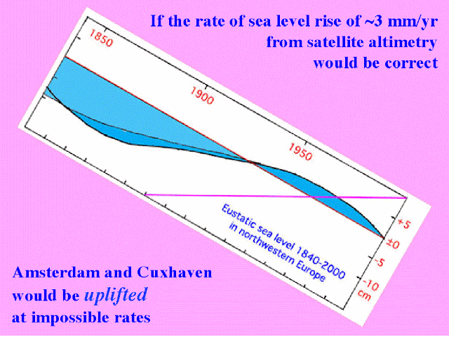
Some of the "evidence" he produced, including this diagram, was fiction, and that which was not pure fiction was generally a misrepresentation of fact - not even the text on this slide is correct. He referred to it as "the current situation"; even those who are visually impaired can see it ends in 2000 - hardly "current" at the end of 2012. It's also a fiction because it doesn't include anything from Stockholm, as the text states, and as the following slide (below) shows; if it had it would be even more of a fiction, as Stockholm is pretty much in the middle of the Baltic, and far from the North Sea. It seems his geography is far from perfect, a failing he reveals elsewhere in his talk - a strange trait in a geologist.
 |
| "Amsterdam and Cuxhaven" - wot, no Stockholm? |
To be fair to Mörner, I think he allows himself to be totally seduced by his own views and controlled by his mindset, and so lacks objectivity. It's behaviour exhibited by conspiracy theorists, and Mörner demonstrates it clearly with his claims of "personal adjustments" of satellite altimetry. All adjustments are published on the 'net, and there are technical forums where they're discussed. The unadjusted data, and adjustment algorithms and relevant data are all available for public access. Does anyone really think that altimetry maps would be produced that could be easily refuted by data from a few tide gauges? From the many tide gauges that are in fact used to check their accuracy? Claims to have shown map inaccuracy invariably have a fatal flaw - they don't compare apples and apples; they don't compare identical periods from the maps and gauges. Comparing apples with apples is to compare the exact rate at the location with the gauge record over the exact same period. Those who seek to debunk the satellite maps are not just comparing apples with oranges, they're setting up a fruit market. More (much more) in a later post on this topic.
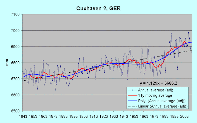
The "North Sea" slide may show the only sea-level "chart" you've seen that Mörner's produced himself. I've found no evidence whatever he's ever downloaded and charted a gauge dataset. It's clearly hand drawn, and the main curve is taken directly from his previous slide which represented Cuxhaven ("Coxhaven" on the slide), on the North Sea coast of Germany, the "German Bight".
Even this graphic contains a slight fiction - note the "2003" in the bottom RH corner; it's in a different font size, and there's no corresponding "tick mark" on the axis. That corner represents 2000, not 2003, as the distance to the previous tick mark shows, and the PSMSL annual chart for Cuxhaven confirms.
 |
| Cuxhaven 2 annual Source:PSMSL |
The red (subsidence rate) line is reproduced on the first slide as the zero line, which explains why it doesn't represent the mean, as is the convention with anomaly-type charts and diagrams. Both lines cross the polynomial curve at 1933, and this graphic shows that the curve diverges from the sea-level line after that point; it merely clips some of the spikes. Up to 1973 or so Mörner's plot matches the PSMSL plot very well; from then on it diverges suspiciously.
 |
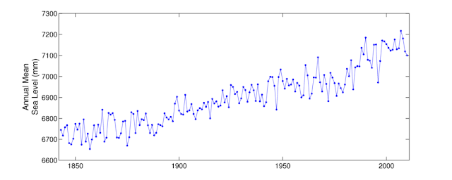
| Cuxhaven annual (to 2010) adjusted down by 1.4 mm/year from 1844. Data source PSMSL |
The text on the slide says "It fits the Earth's rotation (LOD) very well", but it doesn't represent any facts very well. Even if what is shown was true, it would say nothing of sea-level change elsewhere, not even in the North Sea. When land uplift or subsidence (from GPS monitoring stations) are taken into account, long-term North Sea sea-level change rates vary quite widely; some show an upturn in the last decade, some show a downturn, and some show no major variation in rate over the last few decades. Delfzijl is the next station to the west of Cuxhaven, and is just over the German border with Holland.
 |
| Delfzijl, Netherlands Data source: PSMSL |
Giving Mörner the benefit of the doubt, he's been seduced into believing that a polynomial curve supplied by someone else (see "Sea Level is not rising") reflects reality, and has based his sea-level "curve" on that. If he'd actually charted the record himself, with the most up-to-date data available, he couldn't have produced his curve. Data beats hypothesis hands down every time.
The previous slide to his "North Sea" curve (Cuxhaven curve, not quite the same thing) showed the PSMSL chart for Fremantle, Western Australia. Mörner never cites his sources for charts and diagrams and doesn't here; not a very polite nor ethical way of presenting such data.
Ignore that the title says 1897-2011 - it's 1897-2010. Ignore the "1893-2011" mean - Mörner's very bad with start and end dates, as we've seen earlier. Ignore his blatant "cherry-picking" of 1913-1956. Ignore that his "global eustasy" (absolute rise) was derived from just 2 1/2 gauge records in NW Europe (Amsterdam again!). Ignore that there's no source cited, he got it here, and I got the data for my Fremantle chart from the Australian BOM site.
This one's a real cracker though - Mörner commits what might be called evidential suicide. He's telling us that his absolute rate of 1.1 mm/year applies here, calculating a subsidence rate, then he's telling us that there was "little or no absolute sea level rise" which of course means that his rate of 1.1 mm/year doesn't apply here. It also shows no downturn after 2000. Nice one Prof.
I'll also tackle Mörner's famous (or infamous, depending on the point of view) Maldives paper later, which is flawed to the point of being worthless, but here's a taster from its third page (my bold)
The mean sea level seems closely to approximate the surface of a beach rock cut into a flat surface (a rock cut platform). The HTL is at + 0.45 m, the storm level at + 0.9–0.8 m, the sub-recent level is at + 1.2 m, and the old island surface at + 1.45 m. This seems to indicate that the island surface was built up at a 60 cm higher sea level and that the sub-recent level was formed at a 30 cm higher sea level.
A higher sea level of about + 60 cm in Late Holocene times is recorded in sandy environment (e.g. Hulhudhoo in the Baa Atoll) as well as in beach-rock environment (e.g. Fulhudhoo in the Guidhoo Atoll). The sub-recent level seems, in general, to have been at about + 30 cm (in sandy section of the Hulhodhoo as well as in the beach-rock coast of Fulhudhoo).
The most important and interesting fact is the sea level fall of about 20–30 cm between the sub-recent level and the present level. The morphology is clear.......Beautiful logic chain here; seems.....seems....seems.....it's clear! I love that "seems closely to approximate" - how can something "closely approximate" something else? The language and logic "seems to closely approximate" that in IPCC AR4 "Summary for Policymakers", where a number of factors which are "likely" lead to a conclusion which is "very likely". How did he know what the "mean sea level" was, standing on a sandy beach with the waves lapping? All will be revealed in a later (but soon) post.
I'll also discuss his flawed methodology in general in a future post, along with examining more of his gaffes and sleight-of-hand. I thought (silly me!) that being sceptical meant demanding "show me your evidence and your sources". Why has no-one on the sceptical side thought proper to actually examine his claimed evidence and his arguments in detail? Is he immune from such scrutiny? Is he to be believed no matter what he says? Is he infallible in some way, like the Pope? If the answer to any or all of these is yes, then his supporters are guilty of at best double standards and at worst religious adoration.
The audiences at his talks, and readers of his articles lap it all up. "Good old Prof" they chortle "He's sticking it to 'em!". "They" aren't impressed; "they" ignore and ridicule him alternately. He's sticking it to us, sceptics working to call into question shaky science and excoriate alarmists and alarmism. He's pissing into the wind trying to prove the unprovable, and it's sceptics in general getting the spray.


No comments:
Post a Comment