The Southern Oscillation Index, or SOI, gives an indication of the development and intensity of El Niño or La Niña events in the Pacific Ocean. The SOI is calculated using the pressure differences between Tahiti and Darwin.
Sustained negative values of the SOI below −8 often indicate El Niño episodes. These negative values are usually accompanied by sustained warming of the central and eastern tropical Pacific Ocean, a decrease in the strength of the Pacific Trade Winds, and a reduction in winter and spring rainfall over much of eastern Australia and the Top End. You can read more about historical El Niño events and their effect on Australia in the Detailed analysis of past El Niño events.
Sustainted [sic] positive values of the SOI above +8 are typical of a La Niña episode. They are associated with stronger Pacific trade winds and warmer sea temperatures to the north of Australia. Waters in the central and eastern tropical Pacific Ocean become cooler during this time. Together these give an increased probability that eastern and northern Australia will be wetter than normal. You can read more about historical La Niña events and their effect on Australia in the Detailed analysis of past La Niña events.
The ENSO Wrap-Up includes the latest 30-day SOI value, as well as other information on indicators of El Niño and La Niña events.The graph below shows monthly values of the SOI in recent years.
 |
| Source:BOM |
 |
| SOI index 1959-2013 Data source: BOM |
I've added a 25-month (2 year) centred moving average to smooth out the spikes without suppressing the signal. A 13-month MA would seem to be more appropriate, but gives too "lumpy" a trace; a 37-month MA smooths just too much. Like Goldilocks' porridge the 25-month MA is "just right".
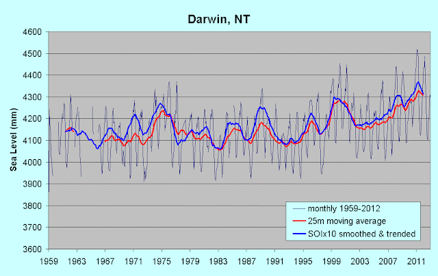
Comparing the SOI plot with a sea-level plot is easy, but I wondered if I could add the SOI to a sea-level chart in some way. One problem is that the signal is relatively small, and the other is that it varies around a (flat, obviously) zero value. I hit on the wheeze of "magnifying" the SOI signal, and normalising the start of the SOI moving average with the start of the sea-level moving average, incrementing the magnified SOI by the monthly sea-level-trend increment. I tried a factor of 10 for magnification, on the basis that the SOI signal is based on air pressure at sea level, and one hPa change leads to a 10 mm sea-level change (in the opposite direction). My assumption may not have had much maths behind it, but the "porridge effect" operated and it was "just right". Here's the result for Darwin:
 |
| Darwin complete sea-level record 1959-2012 Data source: BOM/NTC |
I don't now what you think, but I'd call that a rather good correlation, especially over the right-hand half of the chart. Here's one for Fremantle over the same period.
 |
| Fremantle sea-level 1959-2013 Data source: BOM/NTC |
For both Darwin and Fremantle, note that the recent (since 1994) sharp upward trend has begun a downward reverse, more clearly predicted on the SOI chart which extends to last month (May 2013). The large and broad downward bulge around 1983 corresponds with the intense (some would say most intense on record) El Niño of 1982-3. It shows up well on the 25m MA sea-level plot for Darwin (and most Australian stations), but sea-level rose at Fremantle during that event. All the other El Niños show up on both charts; the broad low during the early 1990s (1991-2 and 1994-5 El Niños, with just 1993 between) and the intense but shorter 1997-8 El Niño. The 2010 El Niño was a more subdued affair.
I think it's clear that the SOI doesn't just affect variations in sea-level, it drives them, at least on the west coast of Australia. In a future post I'll look at other Oz stations for correlation, and where correlation is poor, explore possible reasons.
No comments:
Post a Comment